# 封装组件

# 1.遮罩消息弹窗toast

​ 做成插件的形式、尝试开发插件。

# 基础用法

用来显示不同消息类的操作反馈

展开代码
<!--/plugins/Toast.vue-->
<template>
    <div class="toast-container" v-show="isShow">
        <div class='lo-toast' :class='activeClass'>{{message}}</div>
    </div>
</template>
<script>
    export default {
        name:'Toast',
        data() {
            return {
                isShow: false,
                message: '',
                activeClass: '',
                pre:0
            }
        },
        methods: {
            show(type, message, time = 2000) {
                let nowTime = Date.now();
                if(nowTime-this.pre<2000){
                    return false;
                }else{
                    this.isShow = true;
                    this.message = message;
                    this.activeClass = 'lo-toast-' + type
                    this.pre = nowTime;
                    setTimeout(() => {
                        this.isShow = false;
                        this.message = '';
                        this.activeClass = '';
                    }, time)
                }
            }
        }
    }
</script>

<style scoped>
    .toast-container{
        background-color: #edf2fc;
        animation:toast-animation 2s;
        min-width: 380px;
        box-sizing: border-box;
        border-radius: 4px;
        border: 1px solid #ebeef5;
        position: fixed;
        left: 50%;
        top: 150px;
        font-size: 14px;
        color: #fff;
        overflow: hidden;
    }
    .lo-toast {
        padding: 15px 15px 15px 30px;
    }
    @keyframes toast-animation {
        0%{
            opacity:1;
            transform:translateY(-100px);
        }15%{
             opacity:1;
             transform:translateY(0);
         }85%{
              opacity:1;
              transform:translateY(0);
          }100%{
               opacity: .8;
               transform: translateY(-100px);
           }
    }
    .lo-toast-success {
        background: url("/icon/success.png") no-repeat;
        background-size: 24px 24px;
        background-position: 2px 15px;
        color:rgb(103, 194, 58);
        background-color: rgba(103, 194, 58,.4);
    }

    .lo-toast-warn {
        background: url("/icon/warn.png") no-repeat;
        background-size: 24px 24px;
        background-position: 2px 15px;
        color:rgb(230, 162, 60);
        background-color: rgba(230, 162, 60,.4);
    }

    .lo-toast-danger {
        background: url("/icon/danger.png") no-repeat;
        background-size: 24px 24px;
        background-position: 2px 15px;
        color:rgb(245, 108, 108);
        background-color: rgba(245, 108, 108,.4);
    }

    .lo-toast-info {
        background: url("/icon/info.png") no-repeat;
        background-size: 24px 24px;
        background-position: 2px 15px;
        color:rgb(144, 147, 153);
        background-color: rgba(144, 147, 153,.4);
    }
</style>

# 注册

把Toast组件注册到vue原型上,让每一个组件都可以使用Toast上的属性和方法

//	/plugins/index.js
import Toast from "./Toast";
let ToastPlugin = {
    install(Vue){
        //生成构造器
        const ToastConstructor = Vue.extend(Toast)
        //生成组件的实例化对象
        const toast = new ToastConstructor()
        //把组件的实例化对象和一个dom节点关联
        toast.$mount(document.createElement('div'))
        //把toast组件的根节点挂载到body上
        document.body.appendChild(toast.$el)
        Vue.prototype.$toast = toast
    }
}
export default ToastPlugin;

在main.js导入注册

import ToastPlugin from "./plugins";
Vue.use(ToastPlugin)

# 使用

之后就能通过$toast调用Toast组件上的方法,实现遮罩弹窗消息

$toast.show(type,message,time);

type:success,warn,danger,info

message:遮罩消息内容

time:默认2s后消失

# 2.封装better-scroll滚动

# 安装依赖

yarn add --save better-scroll

# 封装common-scroll组件

由于better-scroll滚动时只能有一个子节点,所以在插槽外再套一层divwrapper容器宽高先不要设置,复用有多种情况,使用时再设置宽高定位。

展开代码
<template>
    <div class="wrapper" ref="wrapper">
        <div>
            <slot></slot>
        </div>
    </div>
</template>

<script>
    import BScroll from 'better-scroll';
    export default {
        name: "CommonScroll",
        props:{
            pullUpLoad:{
                type:Boolean,
                default:false
            },
            probeType:{
                type:Number,
                default: 0
            }
        },
        data(){
            return {
                scroll:null
            }
        },
        mounted() {
            //初始化better-scroll
            this.scroll = new BScroll(this.$refs.wrapper,{
                click:true,//允许在滚动区域点击
                pullUpLoad:this.pullUpLoad,//允许监听pullingUp事件
                probeType:this.probeType,//允许监听滚动
            })
            //监听 滚动到页面区域最底部 默认只能监听到一次
            this.scroll.on('pullingUp',()=>{
                this.$emit('loadMore');
            })
            //只要滚动就回触发该事件
            this.scroll.on('scroll',(position)=>{
                this.$emit('getPosition',position);
            })
        },
        methods:{
            finishPullUp(){
                this.scroll.finishPullUp();
            },
            scrollTo(x,y,time=500){
                this.scroll.scrollTo(x,y,time);
            },
            refresh(){//重新计算可滚动内容的高度,这里很重要
                this.scroll.refresh();
            }
        },

    }
</script>

<style scoped>

</style>

# 使用

loadMore事件,当better-scroll监听到上拉触底时触发,可用于请求下一页数据

getPosition事件,实时获取滚动位置

<common-scroll
                @loadMore="loadMore"
                @getPosition="getPosition"
                ref="scroll"
                :pullUpLoad="true"
        >
    <!--滚动区域-->
</common-scorll>

# 注意

1.better-scorll有时会出现滚动停滞,滚不动的情况。

这是因为滚动内容,比如很多图片在懒加载,高频率重新计算滚动内容高度不对,可以使用防抖函数进行优化,监听图片加载,图片加载完成再重新计算。

给图片添加监听事件@load

<img v-lazy="showImage" alt="" @load="imageLoad">
imageLoad(){
    this.$bus.$emit('imageLoad');//图片加载完成告诉better-scroll
}

使用common-scroll时,mounted钩子中监听事件车,同时防抖,控制refresh计算频率。

const debounce = function(fn,time){
    let timer = null;
    return function(){
        clearTimeout(timer);
        timer = setTimeout(fn,time)
    }
};
const fresh = debounce(this.$refs.scroll.refresh,500)
this.$bus.$on('imageLoad',fresh)

2.移动端布局,常有固定的headernavbar底部导航等。根据情况设置样式

.wrapper {
    position: fixed;
    top: 44px;
    bottom: 49px;
    left: 0;
    right: 0;
}

3.返回顶部backTop

根据getPosition函数监听到的位置信息,控制backTop的显示及功能。

直接通过ref调用better-scroll的滚动事件。

this.$refs.scroll.scrollTo(0,0);

# 3.封装vue-awesome-swiper轮播图

# 安装依赖

yarn add --save vue-awesome-swiper

# 导入注册

import VueAwesomeSwiper from 'vue-awesome-swiper';
import 'swiper/dist/css/swiper.css';
Vue.use(VueAwesomeSwiper, /* { default global options } */);

# 封装

展开代码
<template>
    <div class="swiper" :style="{paddingBottom}">
            <swiper :options="swiperOption" v-if="this.banner.length!==0">
                <swiper-slide v-for="item in banner" :key="item.acm">
                    <img :src="item" alt="">
                </swiper-slide>
                <div class="swiper-pagination"  slot="pagination"></div>
            </swiper>
    </div>
</template>

<script>
    
    export default {
        name: "CommonSwiper",
        props:{
            banner:{
                type:Array,
                default(){
                    return []
                }
            },
            paddingBottom:{
                type:String
            }
        },
        data(){
            return{
                swiperOption:{
                    pagination: {
                        el: '.swiper-pagination',
                    },
                    loop:true,//vue中loop会失效是因为初始的时候没有请求到图片数据,先不渲染,有了图片在渲染swiper就能解决loop失效问题
                    autoplay:{
                        delay:2000,
                    }
                }
            }
        }
    }
</script>

<style scoped>

    .swiper{
        position: relative;
        overflow: hidden;
        height:0;
    }
    /*height:0设置padding填充 防止轮播图由于图片加载造成重排抖动*/
    .swiper img{
        width:100%;
    }
    .swiper /deep/ .swiper-container{
        position: static;
    }
    /*  /deep/  >>> 是注入css   修改第三方组件库默认的样式*/
    .swiper /deep/ .swiper-pagination-bullet-active{
        background-color: red;
    }
</style>

# 使用

banner是图片数据,padding-bottom填充,防止初始图片未加载造成轮播图高度塌陷,抖动重排。

 <common-swiper :padding-bottom="'52%'" :banner="banner"/>

# 注意:

1.由于axios加载图片,初始没有图片,**swiper容器没有高度填充,加载图片会出现重排抖动,**解决办法,给swiper设置height:0;padding-bottom:rem;

2.要修改swiper分页器的颜色,即修改第三方组件的默认样式,可用样式注入 /deep/或>>>

三个箭头写法不支持sass,less等预处理器,/deep/可以。

3.swiper的配置问题,loop:true循环播放会失效,是因为初始时没有图片,swiperOption配置已经生效了,解决办法应该有图片以后才让swiperOption生效,在swiper父容器用v-if条件渲染

# 4.封装slidertransition过渡动画组件

# 4.1针对底部导航nav-bar,左右切换动画

# 封装

展开代码
<template>
    <div class='SliderTransition'>
        <transition :name="name">
            <slot/>
        </transition>
    </div>
</template>

<script>
    export default {
        name: "SliderTransition",
        props:{
            name:{
                type:String
            }
        }
    }
</script>

<style lang="less" scoped>

    .left-leave-active{
        transform:translateX(0px);
        transition:1s;
    }
    .left-leave-to{
        transform:translateX(-100%)
    }

    .left-enter-active{
        transform:translateX(100%);
        transition:1s;
    }
    .left-enter-to{
        transform:translateX(0)
    }

    .right-leave-active{
        transform:translateX(0px);
        transition:1s;
    }
    .right-leave-to{
        transform:translateX(100%)
    }

    .right-enter-active{
        transform:translateX(-100%);
        transition:1s;
    }
    .right-enter-to{
        transform:translateX(0)
    }

</style>

# 使用

<slider-transition :name="name">
    <keep-alive exclude="Detail">
        <router-view class="fade"/>
    </keep-alive>
</slider-transition>

监听路由,配置路由表时,加入meta:{index:Number},根据meta判断动画方向。

watch: { //监视路由的变化
    $route(to, from) {
        if (from.path === '/') return;
        if (to.meta.index > from.meta.index) {
            this.name = 'left';
        } else {
            this.name = 'right';
        }
    }
}

# 注意:

要实现动画的组件给定位,宽高视情况。

.fade{
    position:absolute;
    width:100vw;
    height:cale(100%-49px);
}

# 4.2 普通tabbar切换,左右切换动画

tab选项卡左右切换选项卡,点击保存currentIndex,记录显示的选项卡,内容区v-if或v-show判断currentIndex,实现选项卡切换。

注意:transition组件使用时只能套一个节点,,若是多个节点使用transition-group,并打上key值.

示例:

<tabs @tabClick='toggleTab' :current-index='currentIndex'><tabs/>
<transition-group :name='fadeName'>
    <home-push v-show='currentIndex===0' class='fade' key='homeP'/>
    <home-hot v-show="currentIndex===1" class="fade" key='homeH'></home-hot>
    <home-search v-show="currentIndex===2" class="fade" key='homeS'></home-search>
<transition-group/>

切换tabbar时:判断动画方向。

toggleTab(index) {//子组件传递过来的index
    if (index > this.currentIndex) {  //to from
    	this.currentIndex = index;
    	this.fadeName = "left";
    } else {
    	this.currentIndex = index;
    	this.fadeName = "right";
    }
}

样式同路由切换动画一致,同样需要设置定位。

.fade{
    pposition:absolute;
}

# 5.底部导航tabBar

用插槽的形式,实现

# 5.1封装

# tabBarItem

展开代码
<template>
    <div class='tab-bar-item'>
        <div class="tab-bar-item" @click="handleClick">
            <slot name="item-icon" v-if="!active"></slot>
            <slot name="item-icon-active" v-else></slot>
            <div :style="activeStyle">
                <slot name="item-text"></slot>
            </div>
        </div>
    </div>
</template>

<script>
    export default {
        name: "TabBarItem",
        props:{
            to:String,
            activeColor:{
                type:String,
                default:'red'
            }
        },
        computed:{
            activeStyle(){
                return this.active?{color:this.activeColor}:{};
            },
            active(){
                return this.$route.path===this.to;
            },
        },
        methods:{
            handleClick(){
                if(this.$route.path!==this.to){
                    this.$router.replace(this.to);//底部导航属于同级路由,不要用push
                }
            }
        }
    }
</script>

<style scoped>
    .tab-bar-item{
        flex: 1;
        text-align: center;
        height: 49px;
        font-size:12px;
    }
    .tab-bar-item img{
        width:24px;
        height: 24px;
        margin-top: 3px;
        vertical-align: middle;
    }
    .active{
        color: lightblue;
    }
</style>

# mainTabBar

使用时,根据需求更换icon和文本

展开代码
<template>
    <div class='MainTabBar'>
        <tab-bar>
            <tab-bar-item to="/home" activeColor="#59c3e5">
                <template #item-icon>
                    <img src="~assets/img/tabbar/home.svg" alt="">
                </template>
                <template #item-icon-active>
                    <img src="~assets/img/tabbar/home_active.svg" alt="">
                </template>
                <template #item-text>
                    <p>首页</p>
                </template>
            </tab-bar-item>

            <tab-bar-item to="/category" activeColor="#59c3e5">
                <template #item-icon>
                    <img src="~assets/img/tabbar/category.svg" alt="">
                </template>
                <template #item-icon-active>
                    <img src="~assets/img/tabbar/category_active.svg" alt="">
                </template>
                <template #item-text>
                    <p>分类</p>
                </template>
            </tab-bar-item>

            <tab-bar-item to="/market" activeColor="#59c3e5">
                <template #item-icon>
                    <img src="~assets/img/tabbar/shopcart.svg" alt="">
                </template>
                <template #item-icon-active>
                    <img src="~assets/img/tabbar/shopcart_active.svg" alt="">
                </template>
                <template #item-text>
                    <p>购物车</p>
                </template>
            </tab-bar-item>

            <tab-bar-item to="/profile" activeColor="#59c3e5">
                <template #item-icon>
                    <img src="~assets/img/tabbar/profile.svg" alt="">
                </template>
                <template #item-icon-active>
                    <img src="~assets/img/tabbar/profile_active.svg" alt="">
                </template>
                <template #item-text>
                    <p>个人</p>
                </template>
            </tab-bar-item>
        </tab-bar>
    </div>
</template>

<script>
    export default {
        name: "MainTabBar",
    }
</script>

<style scoped>

</style>

# 6.普通tabBar选项卡

点击选项卡时保存currentIndex,根据currentIndex判断类名active

# 封装

展开代码
<template>
    <ul class="tab-control">
        <li v-for="(item,index) in titles" @click="handleClick(index)" :class="{active:currentIndex===index}">
            <span>{{item}}</span>
        </li>
    </ul>
</template>

<script>
    export default {
        name: "TabControl",
        props:{
            titles:{
                type:Array,
                default(){
                    return []
                }
            }
        },
        data(){
            return{
                currentIndex:0
            }
        },
        methods:{
            handleClick(index){
                this.currentIndex = index;
                this.$emit('tabClick',index);//传递给父组件
            }
        }
    }
</script>

<style scoped lang="less">
    .tab-control{
        display:flex;
        text-align: center;
        line-height: 40px;
        li{
            flex:1;
        }
        .active{
            span{
                padding:5px;
                color:green;
                border-bottom:3px solid green;
            }
        }
    }
</style>

# 使用

titles数组,tabBar的每一项。

tabClick监听tabControl的index值,根据index,可以控制内容区切换。

<tab-control
    ref="tabControl2"
    @tabClick="tabClick"
    :titles="titles"/>
<good-list :goods="goods[currentType].list"/>

# 7.头部导航

移动端头部导航可能分两到三块区域,left可以放一个返回,middle标题,right视情况,一般没有。

# 封装

考虑复用性,用插槽实现。

展开代码
<template>
    <div class="nav-bar">
        <div class="left">
            <slot name="left"></slot>
        </div>
        <div class="middle">
            <slot name="middle"></slot>
        </div>
        <div class="right">
            <slot name="right"></slot>
        </div>
    </div>
</template>

<script>
    export default {
        name: "CommonNavBar"
    }
</script>

<style lang="less" scoped>
    .nav-bar{
        display: flex;
        position: relative;
        z-index: 10;
        height:44px;
        box-shadow: 0 1px 1px rgba(100, 100, 100, 0.1);
        background-color: #fff;
        text-align: center;
        line-height: 44px;
        .left,.right{
            width: 60px;
        }
        .middle{
            flex:1
        }
    }
</style>

# 使用

# 1.只保留middle部分title

<common-nav-bar>
    <template #middle>购物街</template>
</common-nav-bar>

# 2.middle要显示多个item

展开代码
<template>
        <common-nav-bar>
            <template #left>
                <img src="~assets/img/common/back.svg" alt="" @click="goBack">
            </template>
            <template #middle>
                <ul class="nav-bar-title">
                    <li
                            v-for="(item,index) in titles"
                            :key="index"
                            :class='{active:currentIndex===index}'
                            @click="handleClick(index)"
                    >{{item}}</li>
                </ul>
            </template>
        </common-nav-bar>
</template>

<script>
    export default {
        name: "DetailNavBar",
        data(){
            return{
                titles:['商品','参数','评论','推荐'],
                currentIndex:0
            }
        },
        methods:{
            goBack(){
                this.$router.go(-1);
            },
            handleClick(index){
                this.currentIndex = index;
                this.$emit('itemClick',index);//数据发送给父组件,父组件调用滚动方法
            }
        }
    }
</script>

<style scoped lang="less">
    @import '~assets/css/varible.less';
    .nav-bar-title{
        display:flex;
        font-size: 14px;
        li{
            flex:1;
        }
    }
    .active{
        color:@hightTextColor;
        font-weight: bold;
        font-size:16px;
    }
    img{
        margin-top:12px;
        width: 20px;
    }

</style>

# 8. react Suspense loading过渡组件

# 8.1 loading组件封装

展开代码
import React from 'react'
import '@style/loading.scss'
function Loading(){
    return (
        <div className='loading'>
            <div className="loading_box">
                <span className='load1 item'/>
                <span className='load2 item'/>
                <span className='load3 item'/>
                <span className='load4 item'/>
            </div>
        </div>
    )
}
export default React.memo(Loading);

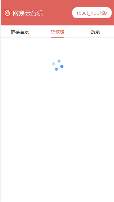
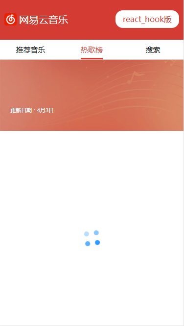
scss样式:四个小圆点,四角分布,不同透明度,旋转动画。定位根据情况调整,水平居中是较理想的。

展开代码
/*loading动画;给定位*/
@keyframes loading_rotate {
  from{
    transform:translateX(-50%) rotate(0deg);
  }to{
  transform:translateX(-50%) rotate(360deg);
     }
}
.loading{
  width:100%;
  height:100%;
  position:fixed;
  background-color: rgba(255,255,255,.2);
  z-index:100;
  .loading_box{
    width: 30px;
    height: 30px;
    position:absolute;
    left:50%;
    top:30%;
    animation: loading_rotate .9s linear infinite;
    .item{
      position:absolute;
      width:10px;
      height:10px;
      display:inline-block;
      border-radius:50%;
    }
    .load1{
      top:0;
      left:0;
      background-color: rgba(24,144,255,.9);
    }
    .load2{
      top:0;
      right:0;
      background-color: rgba(24,144,255,.7);
    }
    .load3{
      bottom:0;
      left:0;
      background-color: rgba(24,144,255,.5);
    }
    .load4{
      bottom:0;
      right:0;
      background-color: rgba(24,144,255,.3);
    }
  }
}

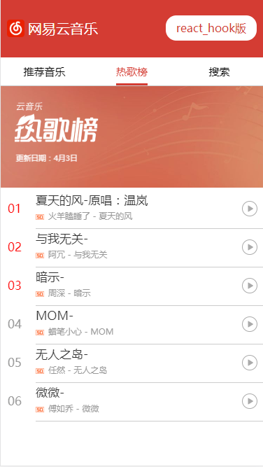
热歌榜是路由组件,列表是异步请求数据,都使用了React.lazy懒加载,Suspense loading,效果图:

loading01loading02loading03

# 9.vue loading组件

loading组件用于,vue axios请求数据,或异步组件加载,过渡状态时显示 loading 动画,避免给用户卡顿白屏体验,样式同 react loading 。

使用时,给组件一个 loading:true 初始值,数据加载完成,设为false。根据 loading 状态 v-show 指令控制loading 显示。

展开代码
<template>
    <div class='loading'>
        <div class="loading_box">
            <span class='load1 item'/>
            <span class='load2 item'/>
            <span class='load3 item'/>
            <span class='load4 item'/>
        </div>
    </div>
</template>

<script>
    export default {
        name: "Loading"
    }
</script>

<style scoped lang="less">
    @keyframes loading_rotate {
        from {
            transform: translateX(-50%) rotate(0deg);
        }
        to {
            transform: translateX(-50%) rotate(360deg);
        }
    }

    .loading {
        width: 100%;
        height: 100%;
        position: fixed;
        background-color: rgba(255, 255, 255, .2);
        z-index: 100;

        .loading_box {
            width: 30px;
            height: 30px;
            position: absolute;
            left: 50%;
            top: 30%;
            animation: loading_rotate .9s linear infinite;

            .item {
                position: absolute;
                width: 10px;
                height: 10px;
                display: inline-block;
                border-radius: 50%;
            }

            .load1 {
                top: 0;
                left: 0;
                background-color: rgba(24, 144, 255, .9);
            }

            .load2 {
                top: 0;
                right: 0;
                background-color: rgba(24, 144, 255, .7);
            }

            .load3 {
                bottom: 0;
                left: 0;
                background-color: rgba(24, 144, 255, .5);
            }

            .load4 {
                bottom: 0;
                right: 0;
                background-color: rgba(24, 144, 255, .3);
            }
        }
    }
</style>
Last Updated: 2020-5-21 22:55:10